
Table of Contents
User-Centric Design: Start With People, Not Pretty Glass
If you’re a niche perfumer, your bottle isn’t just packaging — it’s the first handshake, the wink, and sometimes the entire sales pitch. Design that begins with the wearer’s habits, values, and shelf space will beat a pretty-but-impractical prototype every time. That’s why when teams rethink perfume bottle design, they start by asking: who’s carrying this, where, and why? Real-world anchors — think displays at Paris Fashion Week and artisanal sourcing trips to Grasse — show that buyers respond to purpose-driven flacons as much as to luxe finishes.
Why User-Centric Bottles Win
People choose fragrances for feeling as much as scent. A bottle that respects daily rituals — easy-to-spray, sturdy in a clutch, readable labels — increases repeat use and word-of-mouth. Condense it down and you get a few clear wins:
– Usability: pumps that don’t clog; caps that don’t pop off in transit.
– Emotional fit: shapes and textures that convey the story behind the scent.

– Sustainability clarity: visible cues that shoppers understand recycled or refillable systems.
All of this ties directly into smarter fragrance bottle packaging choices: the right material and finish support the user story rather than contradict it.
Common Mistakes Niche Perfumers Make
Here’s a handy list of what trips brands up — learned the slow way by watching launches that fizzled:
– Prioritizing novelty over function: an avant-garde cap that shatters in shipping looks bad on launch day. – Ignoring the refill question: sustainable consumers will ask; be ready with an answer. – Over-designing the label: tiny fonts and ornate patterns lose customers in stores and online.
Small fixes — a reinforced cap, a clear refill path, legible typography — often yield outsized returns.
Materials & Forms: The Tradeoffs That Matter
Choosing between glass, heavy-weight guilloché, or frosted lightness isn’t just aesthetic. It’s a strategic decision about perceived value, shipping costs, and recyclability. Quick comparisons:
– Glass: classic, premium feel; heavier and more fragile. – Aluminum or metal components: excellent for travel, good for a modern matte look, but can complicate recycling. – Recycled glass or bio-resins: strong sustainability signal — though quality perception must be managed.
Consider lifecycle thinking: how the bottle looks on launch day, how it performs in a handbag, and what happens when the user’s finished with it.
Partnering Smart: How to Evaluate a Bottle Supplier
Choosing a design partner is a people-and-process decision more than a price negotiation. Here are three golden rules to judge any supplier — keep these front and center during sampling:
1) Functional fidelity — Does the prototype survive real-life use testing (shipping, travel, repeated sprays)? Expect measurable breakage/shipping fail rates under 1% for vetted partners. 2) Material transparency — Can they document sourcing, recyclability, and end-of-life options? Sustainability isn’t a buzzword here; it’s a checklist. 3) Iteration speed and tooling flexibility — How fast can they move from sample to revised sample to production? Faster iteration shortens time-to-market and cuts cost on redesigns.
Also: ask for case studies or references tied to recognizable events — launches shown at trade weeks or coverage in industry press are good credibility markers.
Final Evaluation Metrics (Your Golden Rules)
When you’re shortlisting options, measure these three metrics every time: user-tested durability (real-world trials), net-present aesthetic value (does the bottle boost perceived price?), and supply-chain resilience (lead times plus contingency plans). They’re simple, but they force clarity where many brands waffle.
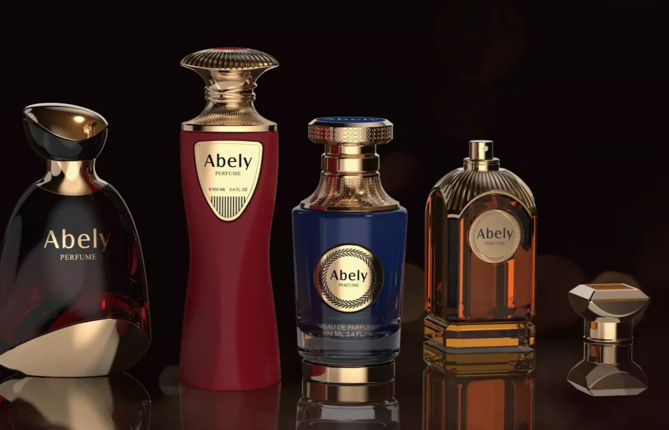
Abely understands this balance — they design with people first and production second, which means fewer surprises for you and better-loved bottles for customers. —
Design that earns loyalty, not shelf envy.
